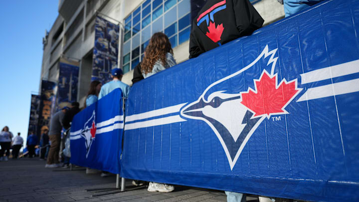
With the Toronto Blue Jays celebrating their 50th season and releasing a new 50th anniversary logo, Jays Journal takes a look at all of the iterations of the teams' logo since 1977.
The First Logo (1977–1996)

The inaugural look for the team, and an undeniable classic. The team name and logo were introduced before the 1977 inaugural season, with famed designer Richard Walker overseeing the task of producing the team’s visual identity.
Walker, who was also involved in the creation of the iconic Montreal Expos logo, worked closely with Labatt Brewing Company (the team’s owner at the time) to create a look that would feel distinctly Canadian while still fitting comfortably within Major League Baseball.
Every minuscule detail of the logo was meticulously planned and tweaked. From the exact shade of blue to the balance between the bird, baseball, and maple leaf, the design feels intentional in a way few expansion teams manage to pull off. The pleasant colour scheme paired with a slightly cartoonish blue jay gave the logo warmth and approachability, without sacrificing legitimacy or seriousness.
50 years of Blue Jays: looking at every logo in franchise history
The maple leaf embedded in the baseball was a subtle but powerful touch, reinforcing Canada’s presence in a league dominated by American teams. Rather than leaning into novelty, the logo felt confident and timeless, helping the Blue Jays establish a visual identity that could stand shoulder-to-shoulder with American League heavyweights like the Yankees and Red Sox.
Blue Jays Logo Redesign (1997–2002)

Following the long tenure of their inaugural logo, the Blue Jays opted for a modernized look that aligned with broader trends across MLB in the late 1990s. This redesign incorporated an art style reminiscent of other teams during that era, particularly clubs like Milwaukee and Houston.
While the logo introduced a more serious blue jay head and darker tones, it retained familiar elements to maintain continuity, including the maple leaf and core colour palette. A less integrated “BLUE JAYS” script ran along the bottom, giving the logo a busier feel than its predecessor.
Its short lifespan limited its cultural impact, but it remains tied to a transitional era defined by stars like Carlos Delgado and Roy Halladay, even if sustained team success never followed.
Alternate Logo Experiment (2003)

This was a strange one. What began as an alternate jersey logo briefly entered the team’s broader visual identity. Being tossed around as an alternate led to the team attempting to trial it as the primary for one season, only to immediately get shut down.
The logo features a mascot-esque blue jay wrapped around a "T', tossing a baseball and sporting a very oddly placed maple leaf tattoo of sorts. Its limited use and short lifespan kept it from leaving much of a mark (I often forget it existed as a primary), but it served as a transitional footnote leading into the more dramatic rebrand that followed.
The “JAYS” Era (2004–2011)

Where all prior Blue Jays logos had aimed to preserve core elements such as the maple leaf and baseball, the 2004 rebrand took a dramatically different approach. Navy blue, black, and grey became the dominant colours, paired with an aggressive “JAYS” wordmark that reflected early-2000s branding trends.
This era was largely defined by mediocrity on the field, though it included standout moments like Jose Bautista’s 54-home-run season and the latter part of Halladay’s prime. Today, the logo is remembered with mixed feelings: divisive and daring, but still nostalgic enough that fans regularly call for black-jersey throwback nights.
Return to Tradition (2012–2020)

Two decades after moving on from their original look, the Blue Jays made a confident pivot back to tradition in 2012. The revived logo refined the beloved bird-and-leaf design with sharper lines and cleaner proportions, striking a balance between nostalgia and modern presentation. Gone were the days of the "Grey Jays", the new identity also looked to represent a departure from the mediocrity of prior years and move elegantly into the future.
The move was both emotional and strategic, reconnecting the franchise with its most successful era while coinciding with renewed relevance on the field. Fans adored the tasteful blending of modernity and tradition, and has been a widely embraced look as a whole. This logo should stick around for a long time, especially after achieving that “modern classic” label, with no reason for it to be replaced anytime soon.
In 2020, Toronto made the individual blue jay the primary mark, slotting the rotunda logo into the alternative logo spot. This was part of a larger trend at the time which saw many sport and brand logos becoming simplified and less detailed.
