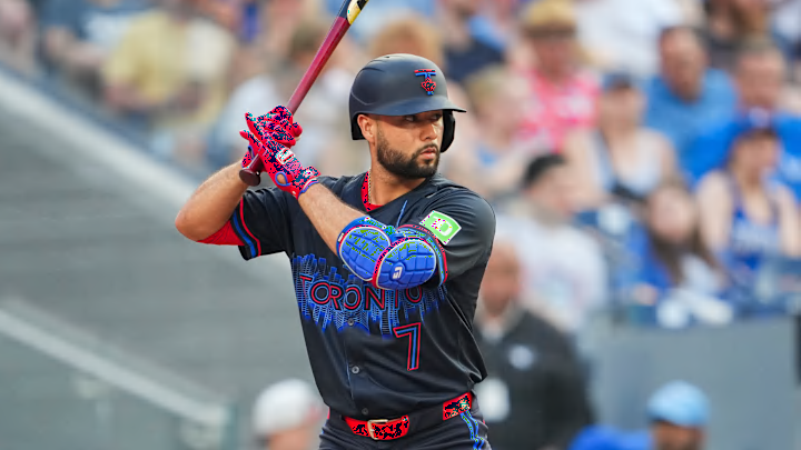
After considerable anticipation, the Toronto Blue Jays unveiled their City Connect jerseys at a release party downtown on May 31st. The uniform, dubbed “Night Mode” features the iconic city skyline in blue, including the CN Tower and Rogers Centre, with TORONTO emblazoned across the chest with an all-black background. It’s the first time since 1999 that the city’s name is on the front of the uniform.
When it comes to the City Connect jerseys, everyone has an opinion, often a strong one. The Athletic recently published an article (subscription required) ranking all 29 special edition uniforms. The Jays are one of eight teams to debut their new threads this season. The Dodgers have moved onto the second iteration of their City Connects, the Yankees haven’t bothered and the A’s, well, let’s say they have other problems.
With so many new looks and thoughts about them, The Athletic ranked them all using a panel-style scoring system to judge the best and worst fits. The four-person team comprised of baseball and fashion writers was asked to rank each jersey from 1-30 (1 being the best), the scores were totaled and averaged and the results were slightly surprising, depending on your perspective.
To little surprise, the Dodgers' unoriginal, uninspiring City Connect theme was voted the worst, a quick look and it’s too similar to their original blue jerseys, with red lettering and white pants, just not a lot of thought seemed to be put into those.
Some of the other baseball fashion clunkers follow in the article, including the busy Motor City-themed Detroit Tigers editions, and the huge font on the Phillies version. The incomplete look of the Giants’ Golden Gate Bridge threads and the lazy re-imagined Orioles presentation, featuring new font and a black background are also included in the mediocre category.
Blue Jays fans hoping to see their team’s new look near the top of these rankings will be disappointed. Coming in just ahead of the Mets’ NYC motif and closely trailing the Diamondbacks Serpientes concept is the Jays’ night mode at #19 with an average score of 17.75.
Perhaps most interesting are the comments from the panelists. Tyler Kepner wrote, “White outlines could have accentuated the fun skyline motif, but without them, we’re left with an illegible blur from more than a few feet away. And have I mentioned that black jersey/black pants are a tired act?” A lighter background would’ve allowed for a more readable text, but that hardly fits with the night mode theme.
Trent Rosencrans echoed what many fans thought with his comments, “The evolution of my reaction to this one: Hat leaks: So good! This could be the best one yet! Jersey leaks: So bad! This could be the worst one yet! Official release: Oh yeah, not good.On-field debut: Better than expected.”
Jason Jones was much kinder in his assessment, “I like the design. It probably would have worked better against a white, gray, or light blue backdrop, but I still like it. Maybe it is just because I like Toronto as a city and seeing the skyline makes me happy.”
Whatever you think of the new design, it’s fair to say the team may have been shortchanged here. A spot somewhere in the top 10 or at least the upper half would seem more appropriate for a fully realized concept compared to some of the selections ahead of them, but it’s all subjective.
