%20%20--%3E%0A%3Csvg%20version%3D%221.1%22%20xmlns%3D%22http%3A%2F%2Fwww.w3.org%2F2000%2Fsvg%22%20xmlns%3Axlink%3D%22http%3A%2F%2Fwww.w3.org%2F1999%2Fxlink%22%20x%3D%220px%22%20y%3D%220px%22%0A%09%20viewBox%3D%220%200%201443.9%20200%22%20style%3D%22enable-background%3Anew%200%200%201443.9%20200%3B%22%20xml%3Aspace%3D%22preserve%22%3E%0A%3Cstyle%20type%3D%22text%2Fcss%22%3E%0A%09.st0%7Bfill%3A%23231F20%3B%7D%0A%09.st1%7Bfill%3A%23134A8E%3B%7D%0A%09.st2%7Bfill%3A%23FFFFFF%3B%7D%0A%09.st3%7Bfill%3A%23E8291C%3B%7D%0A%3C%2Fstyle%3E%0A%3Cg%20id%3D%22Template%22%3E%0A%3C%2Fg%3E%0A%3Cg%20id%3D%22Layer_2%22%3E%0A%09%3Cpath%20class%3D%22st2%22%20d%3D%22M75%2C7.9v143.5c0%2C26.8-21.8%2C48.6-48.6%2C48.6H7.9c-4.4%2C0-7.9-3.5-7.9-7.9v-34.2c0-4.4%2C3.5-7.9%2C7.9-7.9h9.2%0A%09%09c4.4%2C0%2C7.9-3.5%2C7.9-7.9V7.9c0-4.3%2C3.5-7.9%2C7.9-7.9h34.2C71.5%2C0.1%2C75%2C3.6%2C75%2C7.9z%20M53.2%2C14.8c0-1.5-1.2-2.8-2.8-2.8%0A%09%09c-1.5%2C0-2.8%2C1.2-2.8%2C2.8v136.7c0%2C11.5-9.3%2C20.8-20.8%2C20.8H14.4c-1.5%2C0-2.8%2C1.2-2.8%2C2.8s1.2%2C2.8%2C2.8%2C2.8h12.4%0A%09%09c14.6%2C0%2C26.4-11.8%2C26.4-26.4V14.8z%22%2F%3E%0A%09%3Cpath%20class%3D%22st2%22%20d%3D%22M221.8%2C197.7c-1.2%2C1.5-3%2C2.3-4.9%2C2.3h-36.9c-3.7%2C0-7-2.6-7.7-6.3l-3.3-16.1c-0.4-1.8-2-3.2-3.9-3.2h-26.4%0A%09%09c-1.9%2C0-3.5%2C1.3-3.9%2C3.2l-3.1%2C15.9c-0.7%2C3.7-4%2C6.4-7.7%2C6.4H87.4c-1.9%2C0-3.7-0.8-4.9-2.3c-1.2-1.5-1.7-3.4-1.3-5.2L117.3%2C6.4%0A%09%09c0.7-3.7%2C4-6.4%2C7.7-6.4h52.4c3.7%2C0%2C7%2C2.6%2C7.7%2C6.3l38%2C186.1C223.5%2C194.3%2C223%2C196.2%2C221.8%2C197.7z%20M197.4%2C191.5%0A%09%09c0.5-0.6%2C0.7-1.5%2C0.6-2.3L163.9%2C22.3H135l-32.3%2C166.9c-0.3%2C1.5%2C0.7%2C2.9%2C2.2%2C3.2c1.5%2C0.3%2C2.9-0.7%2C3.2-2.1l7.4-37.9h69.3l7.8%2C37.9%0A%09%09c0.3%2C1.3%2C1.4%2C2.2%2C2.7%2C2.2C196.1%2C192.5%2C196.8%2C192.1%2C197.4%2C191.5z%20M159.3%2C27.9l24.3%2C118.9h-67.1l23.1-118.9H159.3z%20M156.3%2C124.5%0A%09%09c0.5%2C0%2C0.9-0.2%2C1.2-0.6c0.3-0.4%2C0.4-0.8%2C0.3-1.3l-4.6-36.7c-0.2-0.7-0.8-1.3-1.6-1.3c-0.8%2C0-1.4%2C0.5-1.5%2C1.3l-4.4%2C36.7%0A%09%09c-0.1%2C0.5%2C0%2C0.9%2C0.3%2C1.3c0.3%2C0.4%2C0.7%2C0.6%2C1.2%2C0.6L156.3%2C124.5L156.3%2C124.5z%22%2F%3E%0A%09%3Cpath%20class%3D%22st2%22%20d%3D%22M335.5%2C2.7c1.2%2C1.7%2C1.5%2C3.9%2C0.7%2C5.8l-43.6%2C118c-0.6%2C1.7-1%2C3.6-1%2C5.5v60c0%2C4.4-3.5%2C7.9-7.9%2C7.9h-34.2%0A%09%09c-4.3%2C0-7.9-3.5-7.9-7.9v-60c0-1.9-0.3-3.7-1-5.5l-43.6-118c-0.7-1.9-0.4-4.1%2C0.7-5.8C199%2C1%2C201%2C0%2C203%2C0h38.8%0A%09%09c3.3%2C0%2C6.2%2C2.1%2C7.4%2C5.1l16%2C57.3c0.2%2C0.6%2C0.8%2C1%2C1.5%2C1c0.7%2C0%2C1.3-0.4%2C1.5-1l16-57.3c1.1-3.1%2C4.1-5.1%2C7.4-5.1h38.8%0A%09%09C332.4%2C0%2C334.4%2C1%2C335.5%2C2.7z%20M310%2C15.7c0.4-0.9%2C0.2-2-0.4-2.8c-0.6-0.8-1.7-1.2-2.6-1c-1%2C0.2-1.8%2C0.9-2.1%2C1.9l-38%2C102.9L228.7%2C13.8%0A%09%09c-0.3-1-1.1-1.7-2.1-1.9c-1-0.2-2%2C0.2-2.7%2C1c-0.6%2C0.8-0.8%2C1.9-0.4%2C2.8l40.5%2C109.5v61.2c0%2C1.5%2C1.2%2C2.8%2C2.8%2C2.8s2.8-1.2%2C2.8-2.8%0A%09%09v-61.2L310%2C15.7L310%2C15.7z%22%2F%3E%0A%09%3Cpath%20class%3D%22st2%22%20d%3D%22M460.2%2C134.4V151c0%2C26.8-21.8%2C48.6-48.6%2C48.6h-65c-4.4%2C0-7.9-3.5-7.9-7.9v-34.2c0-4.3%2C3.5-7.9%2C7.9-7.9h55.8%0A%09%09c4.3%2C0%2C7.9-3.5%2C7.9-7.9v-2.1c0-2.8-1.5-5.4-3.9-6.8l-45.7-26.7c-14.9-8.7-24-24.7-24.1-42V48.7c0-26.8%2C21.8-48.6%2C48.6-48.6h53.2%0A%09%09c4.3%2C0%2C7.9%2C3.5%2C7.9%2C7.9v34.2c0%2C4.3-3.5%2C7.9-7.9%2C7.9h-44c-4.4%2C0-7.9%2C3.5-7.9%2C7.9v1c0%2C2.8%2C1.5%2C5.4%2C3.9%2C6.8l45.6%2C26.7%0A%09%09C451%2C101.2%2C460.2%2C117.1%2C460.2%2C134.4z%20M438.5%2C134.4c0-9.4-5-18-13.1-22.8l-50.2-29.4c-6.4-3.7-10.3-10.6-10.3-18V48.7%0A%09%09c0-11.5%2C9.3-20.8%2C20.8-20.8h43.6c1.5%2C0%2C2.8-1.2%2C2.8-2.8c0-1.5-1.2-2.8-2.8-2.8h-43.6c-14.6%2C0-26.4%2C11.8-26.4%2C26.4v15.6%0A%09%09c0%2C9.4%2C5%2C18%2C13.1%2C22.8l50.2%2C29.4c6.4%2C3.7%2C10.3%2C10.6%2C10.3%2C18v16.7c0%2C11.5-9.3%2C20.8-20.8%2C20.8h-60c-1.5%2C0-2.8%2C1.2-2.8%2C2.8%0A%09%09s1.2%2C2.8%2C2.8%2C2.8h60c14.6%2C0%2C26.4-11.8%2C26.4-26.4V134.4z%22%2F%3E%0A%09%3Cpath%20class%3D%22st2%22%20d%3D%22M613.7%2C7.9v143.5c0%2C26.8-21.8%2C48.6-48.6%2C48.6h-18.5c-4.4%2C0-7.9-3.5-7.9-7.9v-34.2c0-4.4%2C3.5-7.9%2C7.9-7.9h9.2%0A%09%09c4.4%2C0%2C7.9-3.5%2C7.9-7.9V7.9c0-4.3%2C3.5-7.9%2C7.9-7.9h34.2C610.2%2C0.1%2C613.7%2C3.6%2C613.7%2C7.9z%20M592%2C14.8c0-1.5-1.2-2.8-2.8-2.8%0A%09%09c-1.5%2C0-2.8%2C1.2-2.8%2C2.8v136.7c0%2C11.5-9.3%2C20.8-20.8%2C20.8h-12.4c-1.5%2C0-2.8%2C1.2-2.8%2C2.8s1.2%2C2.8%2C2.8%2C2.8h12.4%0A%09%09c14.6%2C0%2C26.4-11.8%2C26.4-26.4V14.8z%22%2F%3E%0A%09%3Cpath%20class%3D%22st2%22%20d%3D%22M759%2C100c0%2C12.9-0.3%2C26-1%2C38.9c-1.7%2C34.2-30%2C61.1-64.3%2C61.1h-2.2c-34.2%2C0-62.4-26.8-64.3-60.9%0A%09%09c-0.7-12.9-1.1-26.1-1.1-39c0-13%2C0.4-26.1%2C1.1-39.1c1.9-34.1%2C30.1-60.8%2C64.3-60.9h2.2c34.3-0.1%2C62.6%2C26.8%2C64.3%2C61.1%0A%09%09C758.7%2C74%2C759%2C87.1%2C759%2C100z%20M737.7%2C137.8c0.6-12.5%2C0.9-25.2%2C0.9-37.8s-0.3-25.2-0.9-37.8c-1.1-22.4-19.7-40-42.1-40h-2.2%0A%09%09c-22.4%2C0-40.9%2C17.5-42.1%2C39.9c-0.7%2C12.5-1.1%2C25.3-1.1%2C37.8c0%2C12.6%2C0.4%2C25.3%2C1.1%2C37.8c1.2%2C22.4%2C19.7%2C39.9%2C42.1%2C39.9h2.2%0A%09%09C718.1%2C177.8%2C736.6%2C160.2%2C737.7%2C137.8L737.7%2C137.8z%20M732.2%2C62.5c0.6%2C12.4%2C0.9%2C25%2C0.9%2C37.5c0%2C12.4-0.3%2C25.1-0.9%2C37.5%0A%09%09c-1%2C19.5-17.1%2C34.7-36.6%2C34.7h-2.2c-19.4%2C0-35.5-15.2-36.5-34.7c-0.7-12.4-1.1-25-1.1-37.5s0.4-25.1%2C1.1-37.5%0A%09%09c1.1-19.4%2C17.1-34.6%2C36.5-34.7h2.2C715.1%2C27.8%2C731.2%2C43.1%2C732.2%2C62.5z%20M709%2C100c0-12.1-0.3-24.3-0.9-36.4%0A%09%09C707.7%2C56%2C701.4%2C50%2C693.8%2C50h-2.2c-7.7%2C0-14%2C6-14.4%2C13.7c-0.7%2C12-1%2C24.2-1%2C36.3c0%2C12%2C0.3%2C24.2%2C1%2C36.3c0.4%2C7.6%2C6.7%2C13.6%2C14.4%2C13.7%0A%09%09h2.2c7.6%2C0%2C14-5.9%2C14.4-13.6C708.7%2C124.3%2C709%2C112.1%2C709%2C100z%22%2F%3E%0A%09%3Cpath%20class%3D%22st2%22%20d%3D%22M894.9%2C2.3c1.5%2C1.5%2C2.3%2C3.5%2C2.3%2C5.6v127.8c0%2C34.1-26.5%2C63.1-60.5%2C64.3c-17%2C0.6-33.6-5.7-45.9-17.6%0A%09%09c-12.3-11.8-19.2-28.1-19.3-45.2V7.9c0-4.4%2C3.5-7.9%2C7.9-7.9h34.2c4.3%2C0%2C7.9%2C3.5%2C7.9%2C7.9v128.7c-0.1%2C7.3%2C5.8%2C13.3%2C13.1%2C13.4%0A%09%09c7-0.1%2C12.5-5.8%2C12.6-12.8V7.9c0-4.3%2C3.5-7.9%2C7.9-7.9h34.2C891.4%2C0%2C893.4%2C0.9%2C894.9%2C2.3z%20M874.9%2C14.7c0-1.5-1.2-2.8-2.8-2.8%0A%09%09c-1.5%2C0-2.8%2C1.2-2.8%2C2.8v122.5c0%2C9.4-3.8%2C18.4-10.5%2C25c-6.7%2C6.6-15.8%2C10.2-25.2%2C10c-19.4-0.7-34.7-16.8-34.4-36.1V14.7%0A%09%09c0-1.5-1.2-2.8-2.8-2.8c-1.5%2C0-2.8%2C1.2-2.8%2C2.8v122.5c0%2C11.1%2C4.6%2C21.7%2C12.6%2C29.4c8%2C7.7%2C18.9%2C11.7%2C29.9%2C11.2%0A%09%09c21.9-1.4%2C38.9-19.7%2C38.7-41.7L874.9%2C14.7z%22%2F%3E%0A%09%3Cpath%20class%3D%22st2%22%20d%3D%22M1037.3%2C189.3c0.9%2C2.4%2C0.6%2C5.1-0.9%2C7.3c-1.5%2C2.1-3.9%2C3.4-6.5%2C3.4h-36.6c-3.3%2C0-6.2-2-7.4-5.1L970%2C152.5%0A%09%09c-0.6-1.5-2-2.5-3.7-2.5h-2.8c-1%2C0-2.1%2C0.4-2.8%2C1.2c-0.7%2C0.7-1.2%2C1.7-1.2%2C2.8v38.2c0%2C4.3-3.5%2C7.9-7.9%2C7.9h-34.2%0A%09%09c-4.4%2C0-7.9-3.5-7.9-7.9V7.9c0-4.4%2C3.5-7.9%2C7.9-7.9h71.4C1014-0.1%2C1035%2C19%2C1037.3%2C44c1%2C10.1%2C1.5%2C20.4%2C1.5%2C30.6%0A%09%09c0%2C10.5-0.5%2C21.1-1.5%2C31.5c-1.1%2C12.4-7%2C23.9-16.5%2C32.1c-1.3%2C1.1-1.7%2C2.8-1.2%2C4.4L1037.3%2C189.3z%20M1016.7%2C74.6c0-9.5-0.5-19-1.4-28.5%0A%09%09c-1.3-13.5-12.7-23.9-26.3-23.8H932v162.7c0%2C1.5%2C1.2%2C2.8%2C2.8%2C2.8c1.5%2C0%2C2.8-1.2%2C2.8-2.8v-57.3l47.9%2C0.1l21.9%2C58.3%0A%09%09c0.4%2C1.1%2C1.5%2C1.8%2C2.6%2C1.8c0.9%2C0%2C1.8-0.4%2C2.3-1.2c0.5-0.8%2C0.6-1.7%2C0.3-2.6l-21.2-56.4c12.7-1%2C22.8-11%2C24-23.7%0A%09%09C1016.3%2C94.2%2C1016.7%2C84.4%2C1016.7%2C74.6z%20M1009.8%2C46.6c0.9%2C9.3%2C1.3%2C18.7%2C1.3%2C28c0%2C9.6-0.4%2C19.3-1.3%2C28.8c-1%2C10.6-9.9%2C18.7-20.5%2C18.8%0A%09%09l-0.1-0.1l-0.4%2C0.2l-51.3-0.1V27.9h51.5C999.8%2C27.8%2C1008.8%2C36%2C1009.8%2C46.6z%20M988.2%2C92.5c0.4-6%2C0.6-12%2C0.5-17.9%0A%09%09c0-5.7-0.2-11.4-0.6-17.1c-0.3-4.2-3.7-7.4-7.9-7.4h-16.8c-2.2%2C0-3.9%2C1.8-3.9%2C3.9v42c0%2C2.2%2C1.8%2C3.9%2C3.9%2C3.9l16.8%2C0%0A%09%09C984.5%2C100%2C987.9%2C96.7%2C988.2%2C92.5L988.2%2C92.5z%22%2F%3E%0A%09%3Cpath%20class%3D%22st2%22%20d%3D%22M1176.9%2C7.9v184.2c0%2C4.3-3.5%2C7.9-7.9%2C7.9h-31.5c-3.1%2C0-5.9-1.8-7.1-4.6l-26.1-56.4c-0.3-0.7-1-1-1.8-0.9%0A%09%09c-0.7%2C0.2-1.2%2C0.8-1.2%2C1.5v52.4c0%2C4.3-3.5%2C7.9-7.9%2C7.9h-34.2c-4.4%2C0-7.9-3.5-7.9-7.9V7.9c0-4.3%2C3.5-7.9%2C7.9-7.9h30.8%0A%09%09c3.1%2C0%2C5.9%2C1.8%2C7.1%2C4.6l26.8%2C57.9c0.3%2C0.7%2C1.1%2C1%2C1.8%2C0.9c0.7-0.2%2C1.2-0.8%2C1.2-1.5v-54c0-4.3%2C3.5-7.9%2C7.9-7.9h34.2%0A%09%09C1173.3%2C0%2C1176.9%2C3.6%2C1176.9%2C7.9z%20M1153.4%2C14.7c0-1.5-1.2-2.8-2.8-2.8c-1.5%2C0-2.8%2C1.2-2.8%2C2.8v155.2l-68.4-147.6h-7.3v165.5%0A%09%09c0%2C1.5%2C1.2%2C2.8%2C2.8%2C2.8c1.5%2C0%2C2.8-1.2%2C2.8-2.8V31.7l67.7%2C146.1h8V14.7z%22%2F%3E%0A%09%3Cpath%20class%3D%22st2%22%20d%3D%22M1330%2C197.7c-1.2%2C1.5-3%2C2.3-4.9%2C2.3h-36.9c-3.7%2C0-7-2.6-7.7-6.3l-3.3-16.1c-0.4-1.8-2-3.2-3.9-3.2h-26.4%0A%09%09c-1.9%2C0-3.5%2C1.3-3.9%2C3.2l-3.1%2C15.9c-0.7%2C3.7-4%2C6.4-7.7%2C6.4h-36.8c-1.9%2C0-3.7-0.8-4.9-2.3c-1.2-1.5-1.7-3.4-1.3-5.2l36.1-186.1%0A%09%09c0.7-3.7%2C4-6.4%2C7.7-6.4h52.4c3.7%2C0%2C7%2C2.6%2C7.7%2C6.3l38%2C186.1C1331.7%2C194.3%2C1331.2%2C196.2%2C1330%2C197.7z%20M1305.6%2C191.5%0A%09%09c0.5-0.6%2C0.7-1.5%2C0.6-2.3l-34.1-166.8h-28.9l-32.3%2C166.9c-0.3%2C1.5%2C0.7%2C2.9%2C2.2%2C3.2c1.5%2C0.3%2C2.9-0.7%2C3.2-2.1l7.4-37.9h69.3l7.8%2C37.9%0A%09%09c0.3%2C1.3%2C1.4%2C2.2%2C2.7%2C2.2C1304.3%2C192.5%2C1305%2C192.1%2C1305.6%2C191.5z%20M1267.5%2C27.9l24.3%2C118.9h-67.1l23.1-118.9H1267.5z%20M1264.5%2C124.5%0A%09%09c0.5%2C0%2C0.9-0.2%2C1.2-0.6c0.3-0.4%2C0.4-0.8%2C0.3-1.3l-4.6-36.7c-0.2-0.7-0.8-1.3-1.6-1.3c-0.8%2C0-1.4%2C0.5-1.5%2C1.3l-4.4%2C36.7%0A%09%09c-0.1%2C0.5%2C0%2C0.9%2C0.3%2C1.3c0.3%2C0.4%2C0.8%2C0.6%2C1.2%2C0.6L1264.5%2C124.5L1264.5%2C124.5z%22%2F%3E%0A%09%3Cpath%20class%3D%22st2%22%20d%3D%22M1443.9%2C157.9v34.2c0%2C4.3-3.5%2C7.9-7.9%2C7.9h-84.2c-4.4%2C0-7.9-3.5-7.9-7.9V7.9c0-4.4%2C3.5-7.9%2C7.9-7.9h34.2%0A%09%09c4.3%2C0%2C7.9%2C3.5%2C7.9%2C7.9v138.2c0%2C2.2%2C1.8%2C3.9%2C3.9%2C3.9h38.2C1440.3%2C150%2C1443.9%2C153.5%2C1443.9%2C157.9z%20M1432.8%2C175%0A%09%09c0-1.5-1.2-2.8-2.8-2.8h-57.5v-158c0-1.5-1.2-2.8-2.8-2.8c-1.5%2C0-2.8%2C1.2-2.8%2C2.8v163.6h63.1C1431.6%2C177.8%2C1432.8%2C176.6%2C1432.8%2C175%0A%09%09z%22%2F%3E%0A%09%3Cpolygon%20class%3D%22st3%22%20points%3D%22543.5%2C98.3%20550.4%2C79.4%20522.9%2C93.2%20529.8%2C65.7%20516.1%2C72.6%20509.2%2C58.8%20502.3%2C72.6%20488.6%2C65.7%20%0A%09%09495.5%2C93.2%20468%2C79.4%20474.9%2C98.3%20468%2C106.9%20490.6%2C118.2%20485.1%2C134.4%20505.8%2C128.5%20505.8%2C132.8%20505.8%2C141.3%20512.6%2C141.3%20512.6%2C132.8%20%0A%09%09512.6%2C128.5%20533.2%2C134.4%20527.8%2C118.2%20550.4%2C106.9%20%09%22%2F%3E%0A%3C%2Fg%3E%0A%3C%2Fsvg%3E%0A)

Toronto Blue Jays: Top 5 Uniforms in Team History

Throughout the relatively short history of the Toronto Blue Jays, the club has put out its fair share of talented players onto the field. To accompany these players, beautiful uniforms would be needed. Since the team’s inception in 1977, they have succeeded on this front. The likes of George Bell, Roberto Alomar, Roger Clemens, Roy Halladay, and now Vladimir Guerrero Jr. have worn a variety of uniforms in Toronto.
These uniforms haven’t come without their share of opinions. Traditional and classic looks, controversial redesigns, revivals of older styles, and new fresh looks have all come and gone. Today we’re looking at the Top Five uniforms they have ever trotted out for us to see. This list will of course be in the fashionable view of this writer.
I’m not just simply looking at the jersey either. To me, uniform means head to toe. How the hat goes with the jersey. How the pants are accented with the piping. All of it.
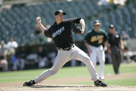
#5: Black Alternate (2004-2011)
Were these hated in their time? Yes. Would I love to see the Blue Jays mix in a black uniform every now and then? Absolutely.
Regardless of how these differ from practically every other uniform in team history, it’s hard to deny that these things were sharp. These uniforms followed an attempt to modernize the Blue Jays look. The shortening of ‘Blue Jays’ to ‘Jays’ on the front was interesting, and the logo is a hybrid of both the bird and the ‘J’ of the logo was an innovative look. All of these ideas and themes to go along with a black base produced a sharp and unique look in the team’s history.
The simple yet effective look represents a polarizing era of Blue Jays baseball. Overwhelming talent with zero playoff appearances. Roy Halladay, Aaron Hill, Vernon Wells, and Alex Rios among others all took the field in these uniforms at one point in time. The lack of success puts a bad taste in fans’ mouths, but I believe the look is clean and effective. Bringing these back on a limited basis would be quite the look.
More Articles About Blue Jays History:
manual
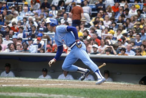
#4: Inaugural Road Uniform (1977)
The first-ever road uniform worn by the Blue Jays. It came in an era of baby blue away jerseys, an era that I am totally here for. All accompanying colours bounce incredibly well off of the light blue base. The presence of white and royal blue scatter both the jersey and pants. The logo on the jersey, however, offers a hint of red which acts as an effective contrast.
The white panel hat that accompanied this ensemble was no slouch either. I still consider the Blue Jays’ white panel hats to be the best they have to offer, and it was no exception in 1977. The inaugural logo was a piece of art as well, and it was spotted dead centre of the jersey.
I’m a big fan of home jerseys sporting the team name, and the away jerseys sporting the city name. The Blue Jays hit this right on the head, with ‘Toronto’ written across the middle in a unique font. It’s hard to find flaws with this uniform, and the team made a splash with their first-ever away uniform offering.
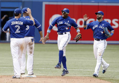
#3: Royal Blue Alternate (2012-Present)
This is the epitome of the Toronto Blue Jays uniform. Everything is just correct with this one, top to bottom. The current logo is perfect. Sharp, sleek, clean, and the colours are exactly what is required. An excellent play on the original. Altogether, this is peak Blue Jays on-field fashion.
This was the centre-piece of the Blue Jays’ return to uniform relevancy. After a few colourless years, the team made a triumphant return to their blue roots. This rich, deep, royal blue alternate jersey goes well with either the white or grey pants. This is the ultimate, “when in doubt” jersey. If the team needs a positive vibe to get them back on the winning track, this jersey is perfect for such motive.
The Toronto Blue Jays have been around since 1977. For the majority of their history, they have fielded clean uniforms. Here are their five best.
This jersey saw the inception of the most recent era of winning baseball. Players like Josh Donaldson, Jose Bautista, Edwin Encarnacion, Troy Tulowitzki, and Marcus Stroman would sport this uniform routinely in the 2015-2016 playoffs. The uniform remains a hit to this day, and I consider it to be a timeless jersey in baseball as a whole.
#2: World Series Home Uniform (1989-1993)
It’s hard to argue that this era wasn’t the peak of Blue Jays hype. Star-studded rosters, back-to-back World Series wins, and incredible uniforms. This look defined a generation of Blue Jays and their fans and continues to inspire looks even today.
You start with the hat. The logo is placed on a white panel to go with a royal blue back and brim. The white panel front is something I wish was in the regular usage of Blue Jays hats today, as it was such a clean and fitting look during games at the Skydome in the 90s. Accompanied was the logo, a tri-coloured work of art. The royal and baby blue on the bird contrasts perfectly, while the red maple leaf fits right in. This is truly a timeless look.
The jersey itself makes use of these same colours, while also employing the classic ‘Blue Jays’ in a unique front across the front. Between the logo, the font, and the multi-colour sleeve ends, there isn’t a single gripe about this jersey.
Lastly, the pants provide suitable support to the rest of the ensemble. The only support needed is the two coloured piping, that being royal and baby blue. This is a combination that would bode well if seen more frequently on the jerseys of today.
All that being said, this is a great look, and I feel is subtly underappreciated in Blue Jays fandom.

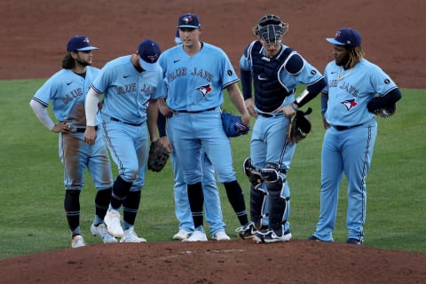
#1 New Blue Alternates (2020-Present)
This is what perfect looks like. This is the exact culmination of the best looks in Blue Jays history, inserted into one of the most talented cores in the city of Toronto as seen from their baseball team.
The hat introduces the colour navy into the fold. Instead of the royal and baby blue pairing we’ve seen in the past, baby blue is now contrasted with navy. This makes for a tasteful and unique look, unique in both Blue Jays and major league history. This shakeup works better than I would’ve first thought. The navy base and baby blue brim on the hat accompanies the unaltered logo very well.
The jersey, meanwhile, uses this contrast even better. The navy and white print, in that wonderful Blue Jays font, pop exceptionally well off of the baby blue. The ‘Blue Jays’ accompanied by the logo makes for one of the best jerseys in Major League Baseball.\
Next. Five Blue Jays Rebuild Trades, and the Prospects Returned. dark
The matching pants and socks do a great job as well. The navy and white piping accent perfectly and the navy socks finished the uniform with a look unlike any Jays’ uniform seen before. We’re fortunate to have gotten this look brought back to us, and we must cherish it for as long as we have it.